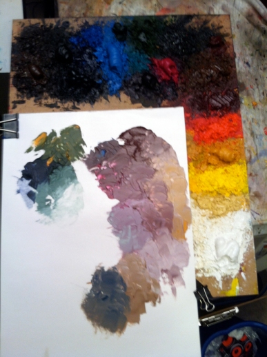
While at the Illustration Master Class I had numerous people stop by and comment on how cool my pallet was. A lot of the artists worked digitally so the mystique of paint appealed to them. I look at my pallet almost every day, so I never gave it much thought, but now I will.
Also while at IMC I got a great tip on two new colors from Donato Giancola: Davy’s Gray (Old Holland) and Mars Violet (Holbine). It’s important to get the right brand because each company makes their colors in a different way. In the past I’d tried an off-brand Davy’s Gray and I hated it. Yesterday I picked up Old Holland’s Davy’s Gray and loved it. Thanks Donato!
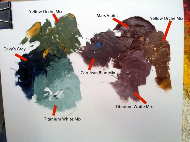
So what makes these colors neat? Let’s start with Davy’s Gray. Davy’s Gray is a greenish gray so it reacts strongly to blue and yellow. In the picture below I mixed in Yellow Ochre to shift the color to green, and Titanium white to lighten the color. I love the murky greenish blue grey that happens when you mix in the titanium white.
As for Mars Violet it is a lovely warm red that’s not too strong in chroma, but the really neat thing is that when you add Titanium White the color shift to a cool red gray! It’s almost like getting to colors for the price of one! Because of this if you mix warm colors with Mars Violet it stays warm, but when you add cool colors it shifts quickly to cool. Normally getting reds to shift to cool requires a lot of mixing. You can see below where I added Yellow Orche and Cerulean Blue.
The pallet above was used in my Freyr's Last Stand painting.
Stay Strange!
Sam Flegal
www.samflegal.com


No comments:
Post a Comment